Band 7–9 TrainingTask 1

IELTS Writing Task 1 Pie Charts – Essay Structure, Samples & PDF

Master IELTS Writing Task 1 pie chart essays with this complete guide. Learn clear high-band structures, precise proportion vocabulary, and a Band 9 sample answer based on global coffee statistics – then practise online with instant feedback.

Visual learning
Band 9 samples
AI Feedback

Overview

Pie charts are one of the most common visual formats in IELTS Academic Writing Task 1. They show how a whole is divided into parts, typically as percentages. Your job is to describe the main features, compare segments, and provide an overview – all within 150+ words.

About IELTS Writing Task 1 Pie Charts

On this page, you'll learn how to write IELTS Writing Task 1 pie chart essays using clear structures, high-band vocabulary, and a Band 9 sample answer based on global coffee statistics. You will see how to describe production, consumption and profit across regions and how to meet the four official IELTS Writing criteria.

What does this task test?

The question usually asks you to "summarise the information by selecting and reporting the main features, and make comparisons where relevant."

  • Describe proportions and percentages accurately
  • Compare majority vs minority shares
  • Compare different charts (e.g. production vs consumption)

Timing & Rules

  • Time:20 minutes (recommended)
  • Length:150 words minimum
  • Task:Summarise main features & make comparisons

Assessment Criteria for Task 1

Task Achievement

Did you describe main patterns instead of listing every number? Is there a clear overview?

Coherence & Cohesion

Is it organized into logical paragraphs? Do you use linking expressions (e.g., in contrast)?

Lexical Resource

Range of proportion language (e.g., "just under a half") and synonyms to avoid repetition.

Grammatical Range

Complex sentences, correct comparatives ("larger than"), and accurate data representation.

Useful Vocabulary & Patterns

To score Band 7+, avoid repeating "increase" and "decrease". Use a variety of precise verbs and adverbs designed for proportions.

Verbs for Proportions

Reporting proportions:

account for, represent, make up, comprise, constitute

Comparing sizes:

be higher than, exceed, be roughly equal to

Fraction Expressions

50%just over half
33%roughly a third
25%a quarter
5%a tiny fraction
TypeExample Patterns
IntroducingThe three pie charts compare global coffee production, consumption and profit distribution...
OverviewOverall, coffee is mainly produced in one part of the world but consumed elsewhere...
DominanceSouth Africa has by far the largest share of production, at just under half...
ContrastAlthough South Africa dominates production, most of the profit is captured by companies...

Band 9 Pie Chart Sample

Based on a prompt about Coffee Production, Consumption, and Profit Distribution.

Sample Question

The pie graphs below show coffee production, consumption and profit distributed worldwide. Summarise the information by selecting and reporting the main features, and make comparisons where relevant.

The first chart shows coffee production by region, the second gives information about coffee consumption, and the third indicates how profit from coffee sales is shared among different groups.

Pie charts showing Coffee Production, Consumption and Profit Gain

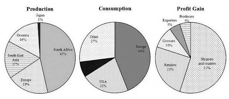
The three pie charts compare global patterns of coffee production and consumption and show how profits from coffee sales are distributed. Overall, coffee is largely produced in one main region but mostly consumed elsewhere, and the greatest share of profit goes to intermediaries rather than to the original producers.

In terms of production, South Africa is by far the most important source of coffee, accounting for 47% of total output. Much smaller but still notable proportions come from Europe, South East Asia and Oceania, with figures of 19%, 13% and 16% respectively. Japan, by contrast, contributes only 1% of global production.

Consumption, however, is dominated by Europe, which is responsible for 44% of worldwide intake. The USA accounts for 24%, while other regions together make up 22%. Japan again represents the smallest segment, at about 8%. This contrast shows that the main consumers are not the same as the main producers and therefore rely heavily on imports.

The distribution of profit is even more uneven. Shippers and roasters gain the dominant share, at around 55% of the total, while retailers receive a further 15%. By comparison, growers earn only 10%, and exporters and producers each receive just 5%. Taken together, those who cultivate and supply the raw coffee beans obtain only a minority of the overall profit.

In summary, the charts highlight a clear imbalance: coffee is grown mainly in producing regions such as South Africa, yet it is consumed and profited from largely in importing markets, where companies involved in processing and selling the product capture most of the financial gains.

How to use this sample

Don't just memorize it. Steal the structure (Intro-Overview-Body-Body) and the phrases (e.g., "accounts for just under half", "dominated by"). Swap in new data for your own practice questions.

Writing Tips

Task Response

  • Always include an overview.
  • Focus on largest/smallest shares.
  • Don't list every number.

Coherence

  • Group logically (e.g. Production vs Profit).
  • Use linkers (while, whereas).

Language

  • Use approximation (about, roughly).
  • Mix simple and complex sentences.

Exam Technique

  • Spend 2-3 mins planning.
  • Aim for 160-190 words.
  • Check spelling of categories.

Practise Pie Chart Task 1 with Lingoleap

Turn theory into real exam practice. Draft your answer in our editor and get instant AI scoring based on official criteria.

Open Task 1 Practice Editor

FAQs about Pie Charts

Do I need to include every percentage?

No. Focus on the most important data: largest/smallest segments and clear contrasts. Group minor percentages.

Should I compare charts or describe separately?

Do both. Describe each chart's main features and highlight relationships between them (e.g. production vs profit).

Is a conclusion necessary?

A summary sentence is helpful but not strictly required if your Overview is strong. The Overview is the most critical part.

Which tense should I use?

Use Present Simple for general facts shown in the chart. If dates are in the past, use Past Simple.

Detailed AI Feedback

Get instant scoring and detailed corrections for your IELTS essays with Lingoleap Premium.

Try for Free